Manchester Council launches award-winning site following research by Keep It Usable
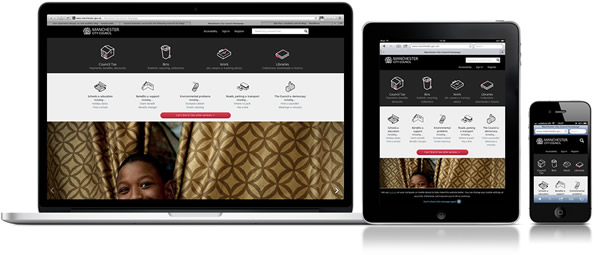
AWARD WINNER! Named the best government site at the prestigious People’s Lovie Awards!
The site came top of a public vote as the best website in the government category, and judges also bestowed the website a silver award and shortlisted it in the ‘best home page’ category from a list of more than 1,500 entries from 20 European countries.
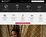
Manchester Council recently launched a radically different, user-centred website following research with local residents by Manchester UX agency Keep It Usable. The result? An overwhelming success.
Releasing a new council website can be tricky – it’s hard to please everyone and people don’t always have a good opinion of their local council. Get it wrong and you can be facing a backlash from residents and councillors.
Council sites need to be user-focussed. Mobile use is growing phenomenally and it’s a trend we see with users during the research we do. The mobile phone is now the new PC. Some people tell us they don’t even turn their computer on, they do everything on their phone because it’s always with them. Knowing that mobile and tablet traffic will double in the next couple of years, the site has been designed responsively to support all devices.
Importantly, the site is designed around the top things that people want to do “Research showed us that 80 per cent of people visit the site to carry out specific tasks and the new site has been designed with this in mind…There is a financial aspect to this too. The more people access services online, the more it helps us to deliver those services more cost effectively.”
“We’ve looked carefully at what residents actually use our website for and redesigned it with their needs in mind. It’s also been tested by real people who tell us that they find it refreshingly easy to use. The way people use the internet has changed dramatically, and as half of all visits to our website will be made using tablets and smart phones within a couple of years, we’ve made sure it can be used easily on these devices as well as more traditional computers. Having a well-designed website is therefore hugely beneficial,” commented Councillor Nigel Murphy, executive member for environment for Manchester City Council”.
The new website was tested by groups of real people from a wide range of ages and backgrounds. Lisa Duddington, head of research for Keep It Usable, said: “Everyone was very positive about the new direction and it was evident that a well-designed council site improves people’s perception of the council and changes their behaviour. The site was so easy and quick to use that people who traditionally always called the council said they would now use the website.”
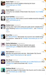
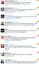
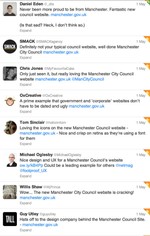
When the site went live we monitored responses on social networks and the result was overwhelmingly positive. Have a look at the comments below and be convinced that making your website user-centred is not an option, it’s a necessity.
Need help with usability testing?
Our work has been featured
Keep It Usable feature in The Guardian: How councils can keep up with changing online trends
Manchester Council: New look website puts residents first
The Drum: Manchester City Council launches new website following consumer research
Amazing user feedback
Share this post:
