The Psychology of choice: Why less is more
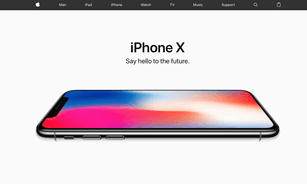
We’ve all been there… sat in a meeting with stakeholders as one person after another insists that their content needs adding to the user interface (often the Home page right? people will argue for days about that one). Or perhaps they’re all fighting for their preferred feature to go into a product, and before you know it, the biggest case of feature creep you’ve ever seen is being drawn on the whiteboard. Your vision of the clean, simple design and intuitive Apple-like user experience that you came into the meeting with has disappeared before your very eyes. Goodbye dream!
But wait! Did you know there is tested science that proves you are right to keep things clean and simple? By keeping options and choice limited, you are actually making it easier and more likely that the user will take action. Here’s why…
The jam experiment
Imagine you’re walking down the street and you come across two stalls selling jam. One stall is selling 24 different types of jam and the other is selling 6 types of jam.
Which stall would you be most likely to stop at and taste the jam?
When we present this experiment in our Psychology talks, we find most people say they would stop at the stall selling 24 types of jam. Some people think this is a trick question, but it isn’t. People LOVE choices. When we ask people in our research sessions about choices, they’ll always go for the larger amount. In the consumer’s head choice = control and they think the more choice, the better.
In the consumer’s head choice = control and they think the more choice, the better
Let’s go back to the jam stalls for a moment. You’ve stopped to taste the jams at both – the stall selling 24 types and the one selling 6 types, in fact, you’re not the only one – 60% of people stop at the stall selling the most jam.
How many jams did you taste at each stall?
You likely tasted the same amount of jams at each stall, despite one having many more types of jam.
Which stall are you most likely to buy from?
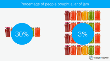
Most people think they would be most likely to buy a jar of jam from the stall selling 24, however, research has proved that you are much more likely to buy from the stall selling just 6 types of jam. These findings are from a research study that was conducted by Psychologists Iyengar et al. They found that when it came to buying the jam, 30% of people bought a jar at the stall that sold 6 types, but only 3% of people bought a jar at the stall selling 24 types.
Customers given too many choices are ten times less likely to buy!
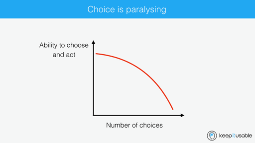
Paradox of choice leads to choice paralysis
Why, when we’re given more options, are we less likely to choose? It’s because we suffer from ‘choice paralysis’. There are too many options for us to satisfactorily compare them and feel that we’re able to make an adequate choice.
More choice requires more time and effort (to go through and compare everything). This can lead to anxiety, stress, unhappiness, high expectations, regret and self-blame if a poor choice is made. It’s hard and it’s difficult to make a good decision when you’re overwhelmed with information and options. You can’t process it effectively.
Instead of the risk of making a poor choice, we choose not to make a choice at all. No action is taken when the cognitive effort to compare all the options is too great.
Too much choice = no choice at all
This goes against how most people think they will behave. This is another thing you should know – people are notoriously bad at predicting their own behaviour. That’s why you shouldn’t ask questions like “How likely would you be to purchase this product?” in your user testing sessions, or if you do, you should at least take the answer with a pinch of salt. There may be some qualitative insights to be gained by asking it if you follow up with a “why?” query, but that insight shouldn’t be treated as a valid response as to whether they would actually buy it or not.
High value and emotional purchases are the hardest to choose
Why is it so much more difficult to choose which car to buy or which holiday to go on than it is to choose which cereal to buy in the supermarket?
There are two major differences in the purchases.
1. Higher emotion
2. Higher cost
Anything that involves increased emotion and cost has increased risk when making a poor decision. After all, who wants to be responsible for ruining the annual family holiday by choosing a poor hotel? For most mums this is a major cause of anxiety and they will spend a phenomenal amount of time tracking down the perfect family holiday.
Barry Schwartz, a psychologist famous for his book ‘The paradox of choice’ states “When you have all these choices, you have an enormous problem gathering all the information to decide which is the right one. You start looking over your shoulder, thinking that if you’d made a different choice, you’d have done better. So there’s regret, which makes you less satisfied with what you have chosen, whether or not there’s good reason to have regrets. It’s easy to imagine there was a better option, even if there wasn’t really, because you can’t possibly examine all of them.”
Less choice = more satisfaction
An interesting finding from the jam study, is that of the people who bought a jar of jam, those who purchased from the smaller stall were much more satisifed.
So, when we’re given too much choice, we’re also much less happy with the final choice we make. It’s because we’re still wondering if we made the right decision. With just 6 jams, it was easy to taste them all and feel confident about our purchase decision, but it’s unlikely we tasted all 24 jams so we leave with our purchase still wondering if there was a better tasting jam that we would have been more happy with. We’re more likely to suffer buyers remorse.
In a study published in the Journal of Consumer Psychology in 2015, researchers analysed 99 studies on choice. They found four criteria that motivate consumers to buy:
1. When people want to make a quick and easy choice
2. When the product is complex (so fewer choices help the consumer make a decision)
3. When it’s difficult to compare alternatives
4. When consumers don’t have clear preferences
Just think of Google
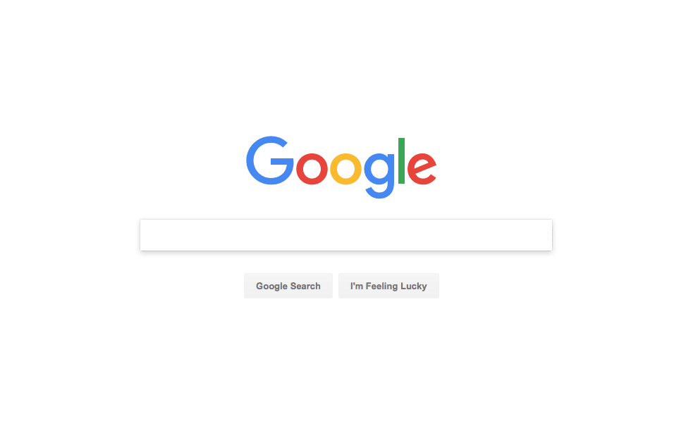
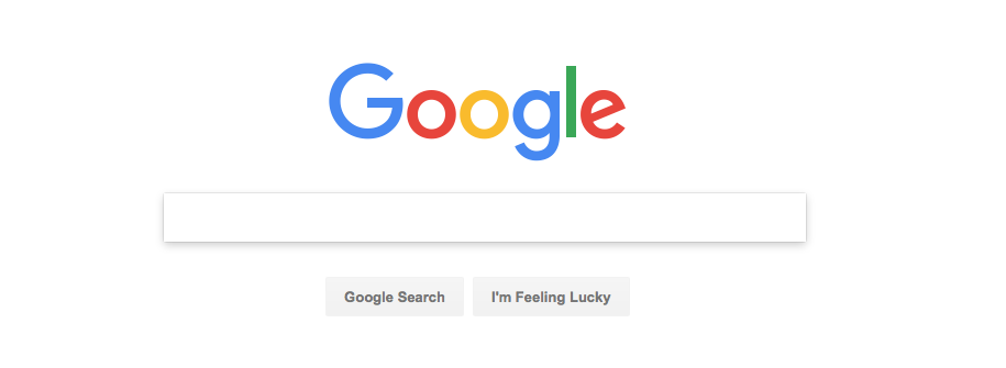
The Google search screen is the best example of how limiting choice results in a great user experience. There is only one thing you can do – it couldn’t be any easier! Whenever you’re struggling within your designs, think about this design, how logical it is, how streamlined the user journey begins, how purposeful the design is to make the user take action.
Psychology in UX: What you can do
1. Focus on the user experience and user journey as opposed to the number of clicks
The 3 click rule is ancient now. All it does it surfaces most content closer to the first step, resulting in a busy home page that is harder to choose from.
2. Declutter, declutter, declutter!
Conduct some major housekeeping and be ruthless with your content. Does it really need to sit on that page? Does it need to be so big? Can you cutdown on the text? Does your primary call-to-action stand out the most?
3. Use white space
Make sure that the content on your pages are able to breathe. Give them space and they’ll stand out more. It will be easier for the user to know to select them.
4. Reduce cognitive load by breaking larger tasks into smaller chunks
Remind users of key information and make it really easy to find, as opposed to making them rely on their memory to remember key information on previous pages.
5. Improve the ability to make good decisions
If your website sells lots of products, like Asos, where you have a lot of choice, you may be thinking how on earth can I deal with the issue of choice paralysis. You won’t be able to fully. But you can make it easier for the user by fully understanding the user journey from their perspective – conduct research and user testing to understand what information they’re looking for and at which moments. What do they need to help them to find the right product for their needs? How can you translate these requirements into an intuitive and logical design?
Conduct research and user testing to understand what information your customers are looking for and at which moments
UX professionals need to remind stakeholders that adding too much into the user interface, requiring too many steps in the user journey, giving the user too many options to choose from only serves to make the user experience more difficult, not easier for the end user.
So, the next time you’re in a meeting and people are trying to feature creep, tell them about the paradox of choice and that there’s proven, scientific logic to keep choice limited.
Learn more psychology
You might also like:
Share this post:
