A psychological explanation of why consumers love colour choice

Whenever colour choice is discussed with consumers, we have always seen a positive reaction
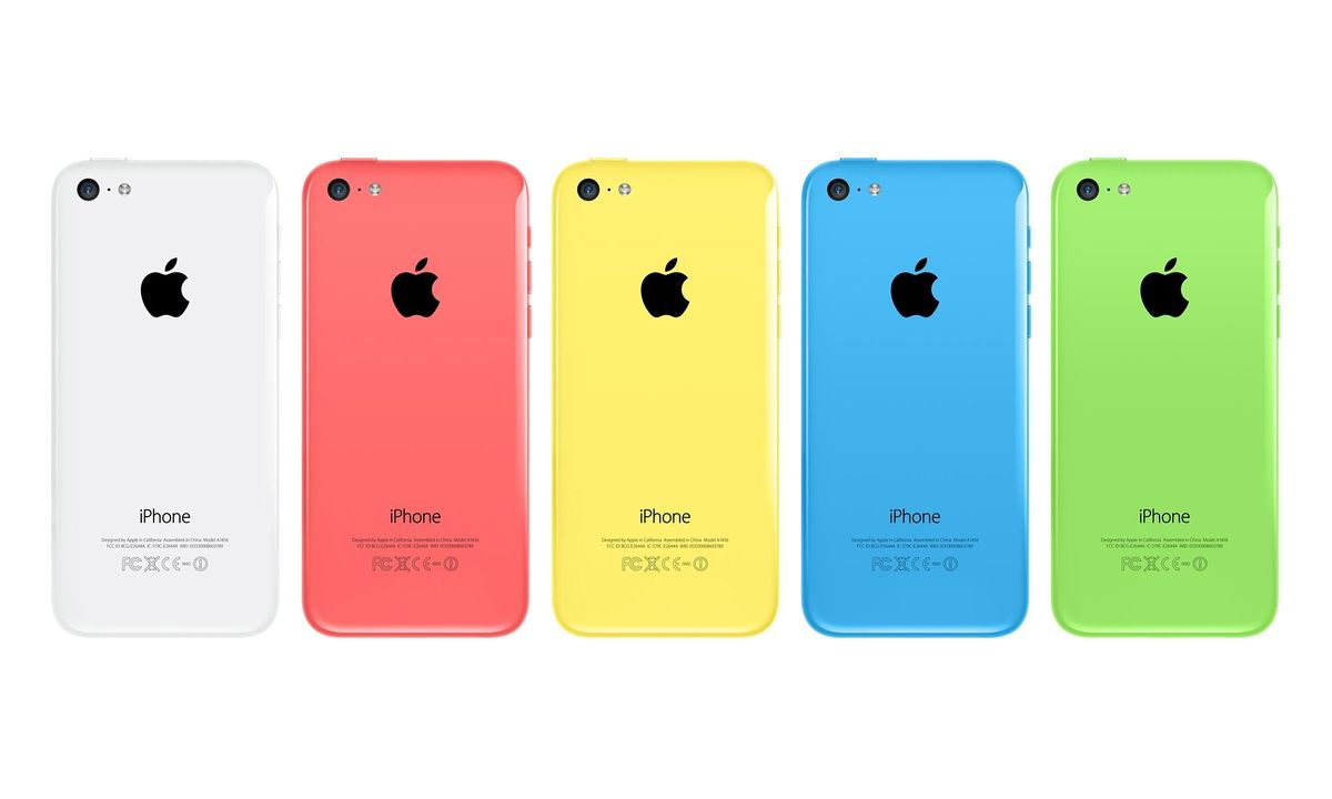
Apple have finally done it with the iPhone 5C! They’ve launched coloured handsets in keeping with their other famously colourful products. Will consumers like coloured phones? Will they appeal to the mainstream user?
For those of you who follow @ux_psychologist on X or have spoken to Lisa in the past, you’ll know that for years she’s been championing colour choice in mobile handsets and it’s been a bug bear that there is so little choice for consumers other than boring, dull colours such as black, dark grey, navy and white. Most people disagreed, their explanation being that a wide variety of colourful cases was all that consumers needed. Sell mobiles in monochrome colours and let people pimp them up if they so desired.
Unfortunately, this limited viewpoint relies on the consumer at the point of purchase having the imagination to envisage each mobile in a colourful case that they haven’t yet even begun to think about. Therefore, one of the major purchase factors is in fact colour.
We’ve conducted hundreds of research interviews and usability tests with mobile users which is why we’ve always been champions of colour choice and personalisation. That’s not to say that you should let people have free reign, people need boundaries and limits otherwise we’ll just see a repeat of MySpace in the 90s all over again!
Whenever colour choice is discussed with consumers, we have always seen a positive reaction, particularly with the female market. We feel that the female consumer has been hugely overlooked in the tech world and unless more women take board positions within tech companies, the only way companies will be able to adapt to the female consumers needs is to listen to them. Simply, conduct research.
So, why is having the choice to personalise a design through the use of colour so appealing to people?
Extension of the self
When people buy products that will be shown and used in public, there is an added social acceptance dimension in the purchase decision – what will other people think? This is where it becomes more difficult to predict human behaviour. People have a multitude of reasons for why they buy something, and if that product is both a high purchase price and something that a wide variety of people in both their current and future social circles will see, the decision becomes more complex, weighty and important.
The mobile becomes a reflection of you, your status in life, your personality, your desires… Knowing this, people will often choose a product that is not a reflection of who they are currently, but who they want to be in the future. It becomes a status symbol of their future self.
Colour helps this expression of themselves as we know through the many articles that have been written on colour psychology – is your personality a bold, confident red or a friendly, reserved blue? Are you a blue but want others to see you as a red so you purchase a red product? Whatever the reasons, people like a choice of colour and are often conscious of what that choice indicates to others about them.
Increased emotional attachment
Admit it, you have an emotional attachment to your mobile don’t you? Most people admit to feeling like a piece of them is missing when they are without their mobile. Increased personalisation increases the amount of human-device attachment that a person experiences. It becomes an expression and extension of themselves which brings with it an increased emotional bond.
Fun
Quite simply, having a colourful phone is more fun! Who wants to look at boring black all day long? Bring on bold, bright colours that make you feel alive, energetic, playful and happy 🙂
Choice and increased control
Who doesn’t love choice! In studies it’s been shown that people love choice, well, they say they love choice ‘the more options the better!’ however in practise this isn’t the case at all. Famous studies that demonstrate the paradox of choice, such as, the jam experiment by Iyengar, prove that when given too much choice people actually don’t make a choice at all. Why? The crux of the issue is that people fear making the wrong choice. Lots of choices puts a lot of demand on the person to weigh up each choice, it’s pros, it’s cons, the implications of making the wrong choice, how they’ll feel if their choice is the wrong one, etc. Given a few choices, people are more likely to make a purchase, will feel more confident about their decision and happier afterwards.
Choice equals more control and a greater feeling of power. Providing more colours for the iPhone 5C is giving more control back to the consumer.
Need help or advice?
If you’d like to know more about UX and how it can help you to create a more successful product, contact our UX experts for free, friendly, no-ties advice.
Other posts you may find interesting:
Share this post:
