Keep It Usable beat hundreds of entrants to the DADI awards

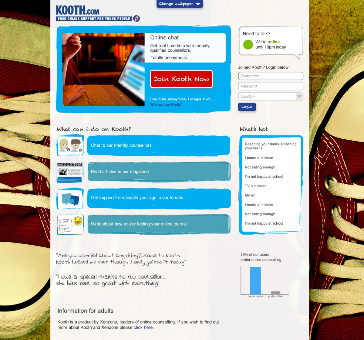
We’re excited to announce that we’ve made it as a finalist in the DADI Awards Usability category for our redesign of KOOTH.com.
Katy Thomson of The Drum told us:
We received over 550 entries this year so getting through to this stage really is a huge achievement. Your work has impressed the panel! You should be very proud of you and your team’s hard work.
For those of you who may be unfamiliar with KOOTH, it’s the UKs most successful online mental health platform for young people. KOOTH.com provides online counselling to 10,000 young people with potentially life-threatening issues such as self harm and suicide through to everyday worries at school or home.
Like many pieces of software, it had been designed originally by experts, in mental health and IT. They had a very successful online service and were clearly incredibly knowledgeable and passionate about their service. They care greatly for their end users and recognise the importance of an easy to use and visually engaging platform, so, having heard of Keep It Usable and our reputation, they commissioned us to redesign KOOTH to make it easier to use not just for young people, but also for their counsellors.

So far, the team have had lots of positive feedback from young people so this is a huge step in increasing the appeal KOOTH has with the target audience as well as increasing engagement with the platform to encourage return use and word-of-mouth referrals.
The results have been phenomenal.
The KOOTH team have also had lots more enquiries and contract wins following the redesign. Feedback from customers and potential customers has been incredibly positive. As well as the UX and visual redesign, KOOTH now incorporates advanced reporting tools that make commissioners lives much easier so they now have the confidence that young people will use the platform and they can easily see the impact and results for their region.
Of course, there’s a huge monetary return on their investment in UX for the KOOTH team. The time saved with the redesigned chat views provides much added value to service users and commissioners based on increased efficiency and effectiveness. The increased appeal to young people should see increased word-of-mouth referrals and increased return use. With the KOOTH team, we wanted to advance the current site to create a place that felt even more young person friendly and remove any existing usability concerns. With new combined chat and case note views, the young person gets even more quality counsellor time. We envisage that with the redesigned and streamlined backend (in collaboration with the team), that less money will be spent on re-training and supporting counsellors in how to use the system.
KOOTH has always been an amazing service for young people, but together, with our combined expertise, we’ve refreshed KOOTH to maintain it’s position as the leader in online mental health for young people and set a very high benchmark.
Share this post: