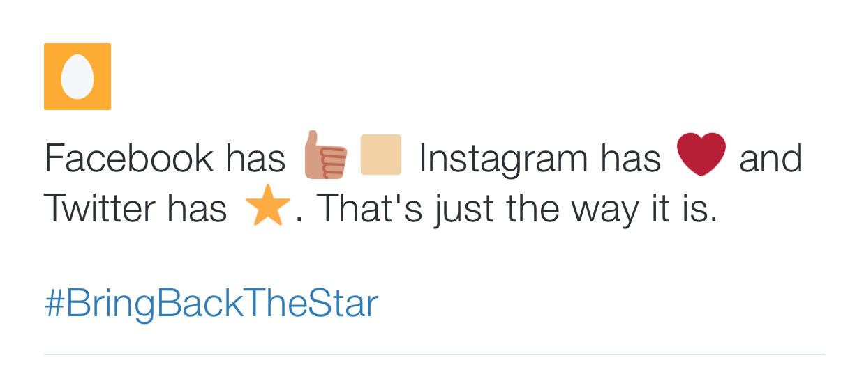
Do you like the #twitterheart? or should @Twitter #BringBackTheStar?
A few days ago, the new Twitter CEO took the brave decision to change the ‘star-shaped’ favourite button (one of the Twitter’s most popular features) with a heart, which is in the companies opinion, a more universal and expressive symbol. However, he seems to have missed a very important point: more expressive for who?
Following the decision a virtual riot arose, particularly among the most loyal twitter users.
As often happens online, features and symbols like stars, hearts or emoticons fill the lack of a physical and tangible interaction, which are crucial for users in order to properly express themselves.
Each social network has different features and characteristics and attracts a different kind of user with different aims and purpose. Social networks are sort of ‘clans’, with different rules and habits, and users choose to become members of one rather than another because of those differences. For twitter users, the star was one of those differences that made the social network unique.
 And as it happens, amongst members of the Twitter clan, they developed a shared ‘meanings code’, a sort of distinctive mark that concurs they are feeling part of the same community. The star was part of the code and users are complaining because they want it back.
What did the star-shaped favourite button mean for users?
Originally, the star was meant as a feature to ‘favourite’ other users tweets, but with the passing of the time, people assigned it various different meanings and uses.
It wasn’t just a simple favourite for users, it has also become for the most, a bookmark for interesting or captivating tweets that users haven’t the time to read immediately, a “this could be interesting and I’ll read it later”. The star also meant “I favourite your tweet, but I don’t like it enough to retweet it”.
Moreover, users used the star for acknowledging that they’ve read someone else’s tweet in the absence of comments.
It happened in a similar way with the hashtag, in that users introduced it for the first time and then Twitter adopted it. Users have generated their own meaning and interpretation of a feature, generating a different direction than what was originally meant by the designers.
Why are habitual Twitter users so strongly against the new ‘heart-shaped’ like button?
First of all, as already said, users on Twitter don’t need a specific feature for liking a tweet; if they really like something, they will retweet it. Secondly, in the users’ mind, the heart-symbol is more related to an emotional and intimate sphere that doesn’t fit a platform like Twitter, but rather a social network like Instagram, where users tend to share more personal images. Thirdly, people don’t like change. Change is stressful, people love their habits, the safety and ease of their routine and they struggle to accept novelties.
Why do Twitter users feel so lost?
The Twitter CEO’s choice, made to encourage a warm and easy welcome to new users that could struggle to understand the meaning of the ‘star feature’, is threatening the loyalty of the existing users.
In ‘real life’ the context is crucial in order to understand and evaluate a situation. If you think about it, your behaviour is modulated by the context in which you are interacting with someone; for example, you will use a different tone of voice or type of language when talking with someone in a church compared to a pub, because you can tell from the context how to behave and adapt in a socially acceptable way.
In the ‘virtual life’ the only clue that you can catch from the digital context is the structure and the features of a website, an app, or in this case, a social network.
The star-shaped button has been fundamental in defining the ‘mood’ of interactions on Twitter; and now users feel lost, they don’t know how to behave, and above all they are concerned they will be misunderstood.
The meaning of a symbol can’t be considered outside the context in which it is immersed, particularly online where the context is ephemeral and intangible and the design is the only clue that can tell users how to behave.
Moreover, in the online environment, the meaning of symbols and features is generated directly from the interaction between users and from the use that people make of them; there are no universal meanings, not even in the global universe of the Internet.
For this, in online contexts, it is crucial to give up any kind of assumptions and strictly observe the users experience, because designers create layouts, but users give them sense.
Share this post:


